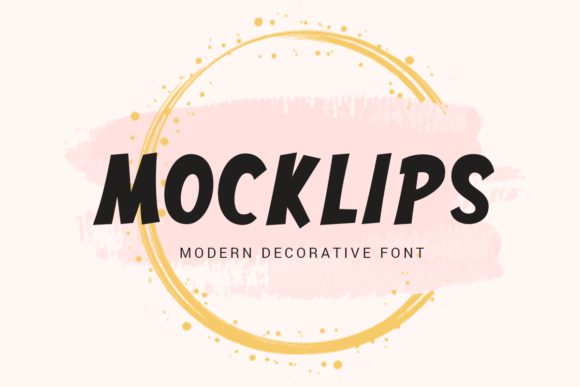
Mocklips: A Bold Display Font That Makes Your Campaign Stand Out
It’s 9:47 a.m. on launch day—and I’m squinting at my phone, scrolling through Instagram previews of the new product teaser series. The first frame loads: clean background, tight crop, bold headline. But something’s off. The text feels timid. Not loud enough. Not *memorable* enough. I swap in Mocklips—and suddenly, the whole frame snaps into focus. It’s not just bigger. It’s bolder, brighter, and unmistakably *there*. That’s when it clicks: the right display font doesn’t just say the message—it makes people stop, recognize, and remember.
Mocklips is that kind of font: a high-energy, playful-yet-polished display typeface built for moments that need instant impact. Its letterforms have confident curves, subtle bounce, and just enough personality to feel human—not robotic or overdesigned. Think rounded terminals, friendly x-height, and open counters that breathe even at small sizes. It’s not trying to be elegant or minimalist. It’s trying to be *seen*, fast—and it delivers.
In real campaign work, Mocklips shines where attention is scarce and clarity is non-negotiable. I used it across six YouTube thumbnails last month—each one needed a clear, scannable label like “FREE GUIDE,” “NEW LAUNCH,” or “30-DAY CHALLENGE.” With Mocklips, those labels popped without crowding the image. No extra stroke, no outline needed—even over busy backgrounds, the contrast held. On Pinterest pins? Same story. Vertical layout, fast scroll, tiny preview—Mocklips’ generous spacing and strong character shapes kept the message legible before users even tapped in.
It’s also become my go-to for email banners and landing page headers. Not for body copy—no, Mocklips isn’t meant for paragraphs—but for the 3–7 word hook that lands the first impression. “Your Best Summer Yet.” “Join the Waitlist.” “Live Workshop Starts Friday.” Short. punchy. unmissable. And because it’s PUA encoded, accessing alternates and stylistic ligatures is seamless—I can toggle between a tighter condensed version for narrow ad spaces and a wider, airier cut for hero banners, all from the same font file.
Readability on mobile? Critical—and Mocklips handles it well. At 24–36px on iOS and Android, it stays crisp and friendly. On dark mode previews? It holds up—especially with light fill (white or soft pastel) and subtle drop shadow for depth. For light backgrounds, I often pair it with a thin stroke or subtle outer glow to prevent visual bleed. And yes—it works on thumbnails under 200px wide. Just avoid stacking more than two lines; Mocklips thrives as a single, commanding statement.
Pairing is where Mocklips really flexes its strategic value. I almost always set it against a clean, neutral sans serif—like Inter, Montserrat, or even system fonts like San Francisco or Segoe UI—for body text, captions, and CTAs. That contrast does heavy lifting: Mocklips shouts the idea, the sans serif explains it. Occasionally, for editorial-style quote graphics or branded newsletter headers, I’ll layer it over a warm serif—say, Cormorant Garamond or Playfair Display—to add texture without clutter. Never pair it with another display font or script unless it’s intentional, minimal, and purpose-built (e.g., one delicate handwritten word beneath a Mocklips headline).
Real use cases keep showing up: a Reels cover announcing a limited-time shop promotion (“FLASH SALE → ENDING SOON”), a webinar banner with date + topic (“JULY 12 | BRAND VOICE MASTERCLASS”), a digital ad set for an online course (“START BUILDING YOUR PORTFOLIO”). In each, Mocklips wasn’t decoration—it was decision architecture. It told viewers *what matters first*, then guided them smoothly into supporting details.
Before locking it in, I always check three things: First, the included weights—Mocklips ships with Regular and Bold, which covers 95% of campaign needs (no Light or Black required here). Second, file formats—OTF and WOFF2 are included, so it’s ready for both design tools and web deployment. Third, licensing—yes, it’s a commercial font, cleared for client work, digital ads, merch, and SaaS platforms. No surprises at delivery time.
One thing I don’t use Mocklips for? Long-form content. Not logos (unless it’s a wordmark-only brand), not navigation menus, not PDF reports. It’s a display font—meaning it lives in the spotlight, not the wings. Use it where you want emphasis, emotion, and instant recognition. Save your workhorse sans for everything else.
And yes—it works beautifully in branding systems, but only when anchored by consistency. If you’re building a full identity, Mocklips can anchor your campaign headers, social highlights, and promo assets while your primary brand font handles logotypes and voice-driven copy. That duality—personality + precision—is what makes it feel professional, not playful-for-playful’s-sake.
Last week, I built a set of five Instagram Story templates for a seasonal sale. Mocklips handled all the “SALE,” “UP TO 40% OFF,” and “ENDS TONIGHT” callouts—each one sized, spaced, and color-matched to the brand’s palette. No kerning tweaks needed. No fallbacks. Just clean, confident typography that made the offer feel urgent and authentic.
That’s the quiet power of the right display font: it doesn’t distract. It directs. It doesn’t shout over your message—it gives it volume, shape, and speed. Mocklips does that without asking for extra effort, extra plugins, or extra explanation. Just install, select, and watch your campaign visuals gain clarity—and confidence.